
Christ Community Church: Montreat is an Evangelical Presbyterian Church (EPC) located on the campus of Montreat College in North Carolina. They value their community outreach, youth programs, and supporting mission work worldwide.
The communications coordinator of the church approached our team with two issues: an existing reputation of being the “rich” church in town, and their website not being as easily accessible for the elderly congregants, who may not be as “tech-savvy”.
For the first 2.5 weeks of the project, our redesigns were conceptual. After seeing the final high fidelity prototype, the organization contracted my group and I to implement our redesign ideas into their live website, with a 5 week timeline to conduct further research, design, and testing.
My Role
UI Design Lead
(Team of 3 Designers)
Constraints
Desktop Website
Squarespace
Timeline
7.5 Weeks
(Jun 15 - Jul 1,
Aug 24 - Sep 21, 2022)
Project Overview
Objectives:
-
Create a more user-friendly website for their older members
-
Tell the story of who they are and their “vibe” so they are more welcoming to newcomers
-
Make the Livestream more accessible
-
Maintain brand awareness as well as member expectation
-
Achieve deliverables by designated deadlines
Challenges:
-
Design webpages that meet accessibility standards
-
Find a way to measure how "welcoming" the site can be
-
Streamline site navigation and consolidate menu categories
-
Conducting research under time constraints
-
Develop a redesign that can be maintained by current church staff
Results
400%
20%
80%
Faster Livestream Navigation
Faster Overall Site Navigation
of Users Found it "Welcoming"
Click Here to View the Site
Research

After surveying 28 people and interviewing 7 of those people, I learned...
Find Sunday Livestream
Sign-Up for Volunteer Opportunities
Find Sunday School Classes
-
77% of participants stated they visit the site for the Sunday Livestream
-
Users stopped at 3 different places for Livestream, with the longest search time of 4 minutes
-
69% visited to learn about upcoming events within the Church and sign up for volunteering
-
Users consistently had to search around the website to find how to volunteer
-
There was confusion with “Need Help” and “Sunday School” menu categories
Desired Qualities
-
Participants desired a sense of belonging, whether it be through shared beliefs, or personal invitation to attend the church
-
Having a church within close proximity was important to them
-
They valued the aesthetics of both the church and its website
-
They wanted opportunities to give back to the community and stay involved
Competitive Analysis

So How Might We...
Keep
Members and nonmembers engaged
Highlight
The beliefs of the church in a beautiful and welcoming way
Increase
Engagement in the church that will encourage members to become more active in the community
When going through possible solutions we noticed that all of our ideas encompassed 3 main things:
Engagment
Welcoming
Community
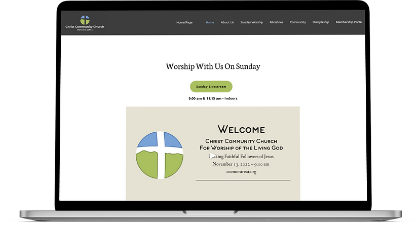
Previous Homepage
1.
The majority of the site's color combinations were a failing grade regarding WCAG, meaning that using them wasn't advisable for those with visual impairments.
The denomination of the church was initially unclear
3.
Multiple addresses, some without labels
7.

5.
4.
6.
7.
1.
3.
2.
2.
Depending on the monitor size your navigation bar changes from a drop-down menu bar to a hamburger menu, which is a three-lined collapsed navigation bar
4.
Inconsistent button sizes
Inconsistent fonts & font sizes
5.
6.
Multiple buttons near each other for the same thing
Overall, there was no clear organization on the homepage.
Barry needs a clear way to find what’s going on in the church so that he can stay involved in the community by giving back and helping his fellow members and newcomers feel welcomed.

“As part of my faith, I want to participate in the activities of the church to make sure that we continue to enforce our faith and help our fellow families that need it.”

Meet: Barry
(The Current Member)
-
Has been coming to the church with his family for years, and takes pride in now being considered an elder. He’s very ingrained in the church community and welcomes new attendees
-
Motivated to feel connected to his fellow church members and the community at large
-
Is thankful for the Sunday live stream option since Covid, but is technically challenged. It takes him time to get the hang of navigating websites
-
If he has any questions, he is more likely to call someone at the church rather than go online

Meet: Natalie
(The Newcomer)
-
Has been going to the same church since she was young. Recently moved, and looking for a new place to call home
-
Her faith is important and it’s important to choose a church with the same beliefs that she has, as well as welcoming and accepting of different people
-
She uses church websites to gauge the environment and see if it's fun, and vibrant, with ample opportunities to volunteer and participate in different activities
-
Frustrated by websites and apps that are overwhelming to use, and require spending too much time to find what you are looking for
Natalie needs a way to determine if a church has a diverse and inclusive community that aligns with her beliefs and feels vibrant because she wants a place that feels welcoming.

“I am swayed by the general ambiance, whether that be the architecture or the vibe of the community. If the vibe of the actual parish is not right, it puts me off.”
SITE-MAP BEFORE

SITE-MAP AFTER

1.
2.
1.
2.
The primary navigation categories in dark boxes (community, discipleship, membership) indicate primary navigation changes.
Yellow highlighted subcategories also indicate subcategory changes.
Design Studio
Round 1:
8 Ideas in 5 minutes

Round 2:
1 Big Idea in 5 minutes

I wanted our client to be included in this exercise because I felt it was integral in creating a connection between them and the redesign, as well as fortifying a sense of trust with our team. The activity was ultimately successful at achieving both of those goals, and despite their claims of "not being artistic", the client was still able to come up with ideas that I would later incorporate into the final version.
Screens
Screens presented are for DESKTOP
Homepage
Wireframe

About Us
Wireframe

Newsletter
Wireframe

Directions
Wireframe

Hi-Fi Prototype (Figma)

Hi-Fi Prototype (Figma)

Hi-Fi Prototype (Figma)

Hi-Fi Prototype (Figma)

Current Webpage

Current Webpage

Current Webpage

Current Webpage

Membership Portal
Hi-Fi Prototype (Figma)

Realm Log-In
Hi-Fi Prototype (Figma)

Current Webpage

Current Webpage
%20%E2%80%94%20Christ%20Community%20Church.png)
Style Guide


Usability Testing
100% of users reached the Livestream with an average of 11 seconds
There was still a noticeable lack of diversity to some users
The Newsletter was too long and dense, making it harder to find upcoming events
With this project, I learned that consistent and transparent client engagement is key in both building trust and establishing clear design goals that will not only meet the needs of the organization but fulfill the needs of the users. I also learned that accessibility is incredibly important, and by creating an all-encompassing user experience, you can have a positive impact on your target community.
